Makeup Contrast Made Easy: 4 Guides + Checklists Pack
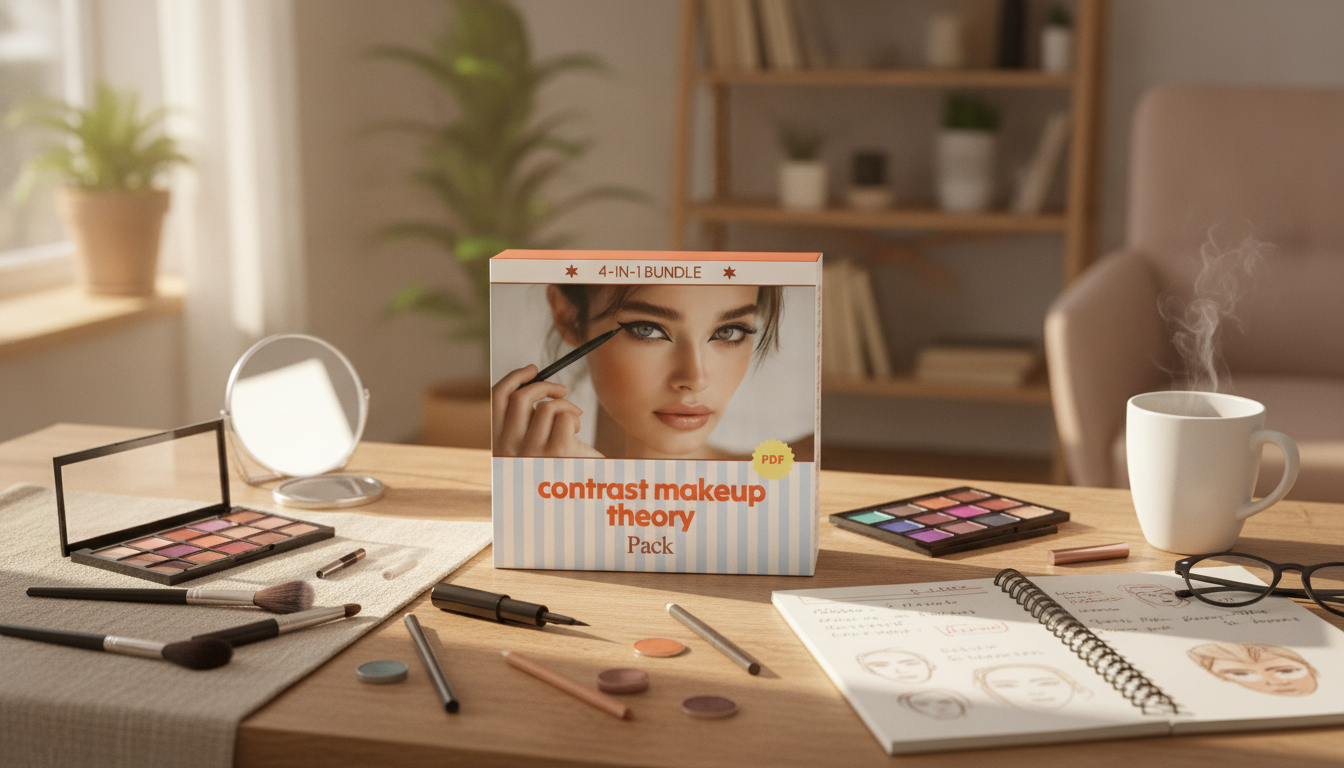
Contrast Makeup Theory Pack: 4 Guides and Checklists for More Balanced Looks
Contrast in makeup is the relationship between light and dark, soft and bold, and muted versus vivid features. When contrast choices match a person’s natural coloring, makeup can look polished and effortless; when they clash, it can feel heavy, washed out, or uneven. The Contrast Makeup Theory Pack brings contrast concepts into practical, repeatable steps through four focused guides plus checklists that make day-to-day application faster. It’s designed to help streamline shade selection, placement, and intensity—whether the goal is “barely there” definition or high-impact glam that still looks cohesive. For more guidance, see Can You Use FAFSA For Cosmetology School? Also Grants, 529 ….
What “contrast” means in makeup
Contrast is less about one “right” style and more about creating the right relationships on the face. A few types show up in nearly every look: For further reading, see Credit for Prior Learning – Academy of Art University.
- Feature contrast: the difference between hair, skin, and eye depth (for example, dark hair with light skin versus medium hair with medium skin).
- Value contrast: how light or deep colors appear on the face (foundation match, contour depth, brow intensity, liner and mascara strength).
- Chroma contrast: muted/soft colors versus vivid/saturated colors (peachy-beige vs bright coral, taupe vs jet black).
- Edge contrast: soft, diffused edges versus crisp, sharp lines (smudged liner vs winged liner, blurred lip vs defined lip).
Why it matters: makeup that mirrors natural contrast often reads harmonious and “intentional,” even at higher intensity. For a deeper foundation on how humans perceive color relationships, see Encyclopaedia Britannica’s overview of color or Pantone’s color education resources.
How to identify a personal contrast level
Personal contrast is easiest to spot when the face is free of added depth and shine.
- Start bare-faced in daylight: notice the natural depth of brows, lashes, and lip tone against skin.
- Compare hair-to-skin difference: larger differences typically support stronger value contrast (deeper mascara, clearer brow definition, bolder lip boundaries).
- Check eye definition: high-definition eyes (strong limbal ring, deep iris) often tolerate more liner/mascara contrast; softer eyes may look better with softened edges and mid-tones.
- Notice natural lip depth: if lips are naturally deeper than skin, higher-contrast lip colors can look seamless; lighter natural lips may benefit from soft-to-medium lip depth for everyday.
- Scale for the occasion: let personal contrast set the “baseline,” then increase intensity for events without losing balance.
Skin prep also changes how contrast reads (a very dewy base can visually soften depth; a matte base can make edges look sharper). For skin-friendly application reminders, the American Academy of Dermatology’s makeup and skincare tips are a helpful baseline.
What’s included in the 4-in-1 pack
The Contrast Makeup Theory Pack | 4-in-1 Beauty Guides & Checklists breaks contrast theory into choices that can be repeated quickly: what depth to pick, where to place it, and how sharp to keep edges.
- Four coordinated guides that translate contrast principles into decisions for complexion, brows, eyes, and lips.
- Ready-to-use checklists to reduce guesswork (shade depth, finish, placement, and edge style).
- A repeatable framework that supports a capsule routine: everyday face, elevated day look, and a more dramatic option.
- Useful for organizing products already owned by depth (light/medium/deep), finish (matte/satin/dewy), and intensity (soft/defined/bold).
- Designed to help avoid overcorrecting: choosing one or two areas for higher contrast while keeping the rest balanced.
Pack components and how they help
| Guide/Checklist | Focus area | What it helps decide |
|---|---|---|
| Complexion contrast guide | Base, contour/bronze, highlight | Depth and placement that adds dimension without looking muddy or overly sharp |
| Brow & lash checklist | Brows, mascara, tightlining | How defined to go and whether to choose soft brown, deep brown, or black |
| Eye contrast guide | Shadow, liner, edges | Soft gradients vs crisp definition; how to balance lid depth with crease and lash line |
| Lip contrast checklist | Lip liner, lipstick, gloss | Blurred vs sharp lip edge; nude depth; when bold shades look most cohesive |
A simple routine that uses the checklists
Contrast works best when the face has a clear “anchor” and everything else supports it.
Quick reference: contrast choices by desired effect
| Desired effect | Brow/eye approach | Lip approach | Cheek approach |
|---|---|---|---|
| Soft everyday | Soft brow definition; smudged liner; brown mascara | Blotted or satin nude; softened lip line | Diffused blush; minimal contour |
| Defined polished | Clear brow shape; focused lash line depth; neutral mid-tone shadow | Defined nude or classic shade; satin/cream | Moderate contour/bronze; controlled blush |
| High-impact glam | Crisper liner or deeper lash line; bolder contrast placement | Crisp bold lip or high-shine statement | Stronger cheek structure; highlight placed precisely |
Common contrast problems and quick fixes
Who benefits most from contrast-based guides
Using the pack with a digital or printed routine
If you like checklist-based digital toolkits in general, these in-stock options follow a similar “step-by-step + trackable” format: Muscle Sculpting Toolkit for Women: Sculpt & Shred Guide, Checklist, and More and Kids Finance Toolkit: From Allowance to Awareness | 3 in 1 Bundle of Money Guides & Checklists.
FAQ
Is this pack better for beginners or experienced makeup wearers?
It works for both. Beginners get a clear decision system for depth, placement, and edges, while experienced wearers can use the checklists to calibrate intensity, undertone harmony, and finish faster for different occasions.
Can contrast theory work for any skin tone and undertone?
Yes—contrast theory is universal because it focuses on relationships (light vs dark, soft vs sharp, muted vs vivid). Undertone still matters for picking flattering shades within the right contrast level.
How do I know if I should increase contrast or soften it?
If features disappear or look “flat,” add controlled depth (brows, lashes, blush, or subtle contour). If makeup looks harsh, soften edges first or slightly reduce depth/saturation, adjusting one area at a time so the face stays balanced.












Leave a comment